What clients say
"Chike joined us when we were looking to completely refresh our product experience... The final result was incredible, and that’s because of how much creative intent he put into it."
"Chike has been a great addition to our team. He always goes above and beyond to accomplish tasks... He proactively seeks to improve upon what has been previously done."
"Implementing Chike's designs was always a pleasure. I always wanted every-other designer on the team to have been like him. His designs have always been clean and standard-looking."
"He’s an amazing hard worker, very detailed, and highly communicative... He helped us completely transform our design system and accelerated our ability to deliver new features."
"Chike is not only a skilled designer but also an excellent communicator... One of his notable strengths is his passion for innovation. He constantly brings fresh ideas to the table."
"Implementing Chike's designs was always a pleasure. I always wanted every-other designer on the team to have been like him. His designs have always been clean."
Skills
Tech Stack
Figma
Bubble
Photoshop
Clickup
Slack
Gemini
Experience
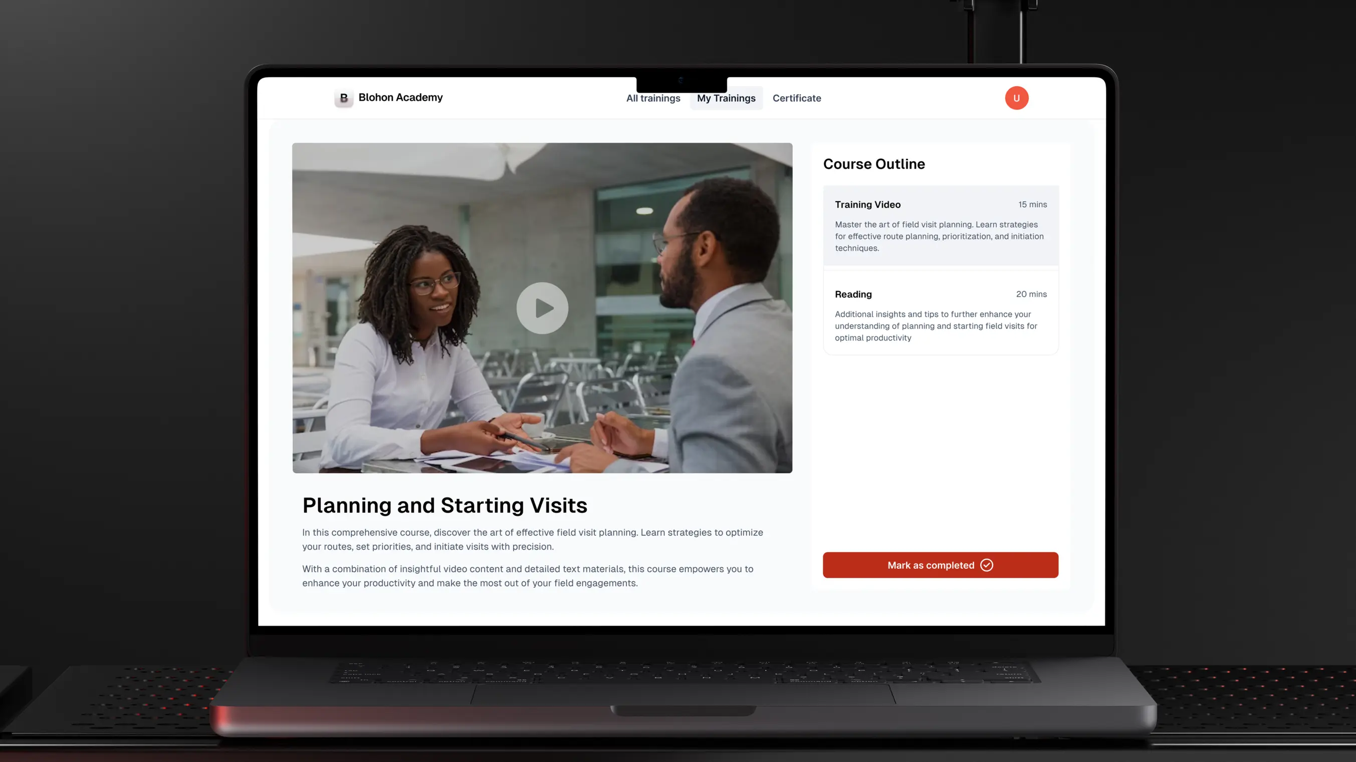
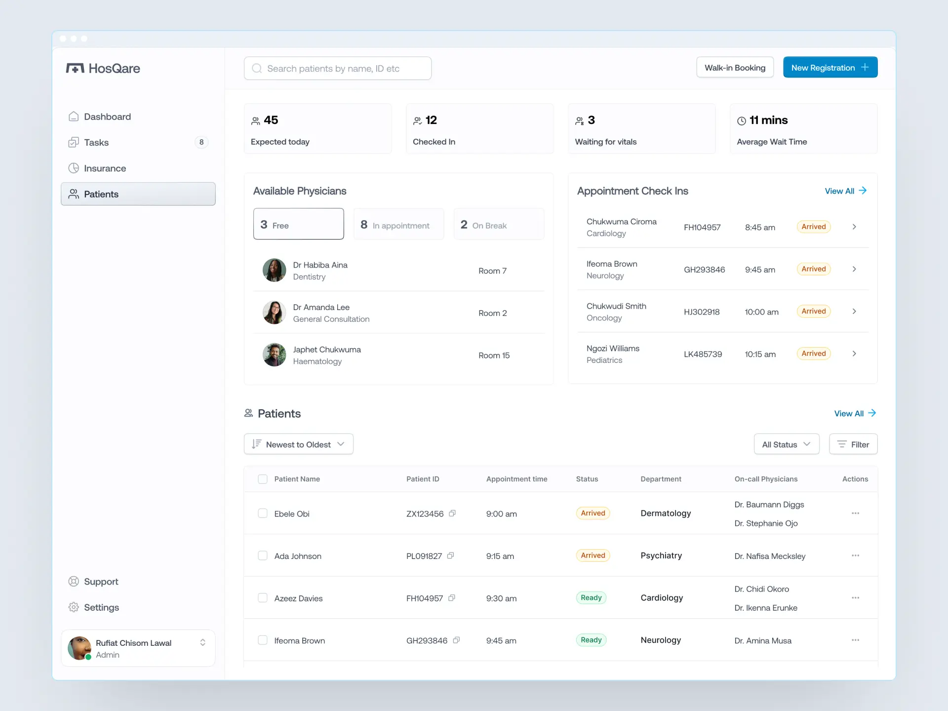
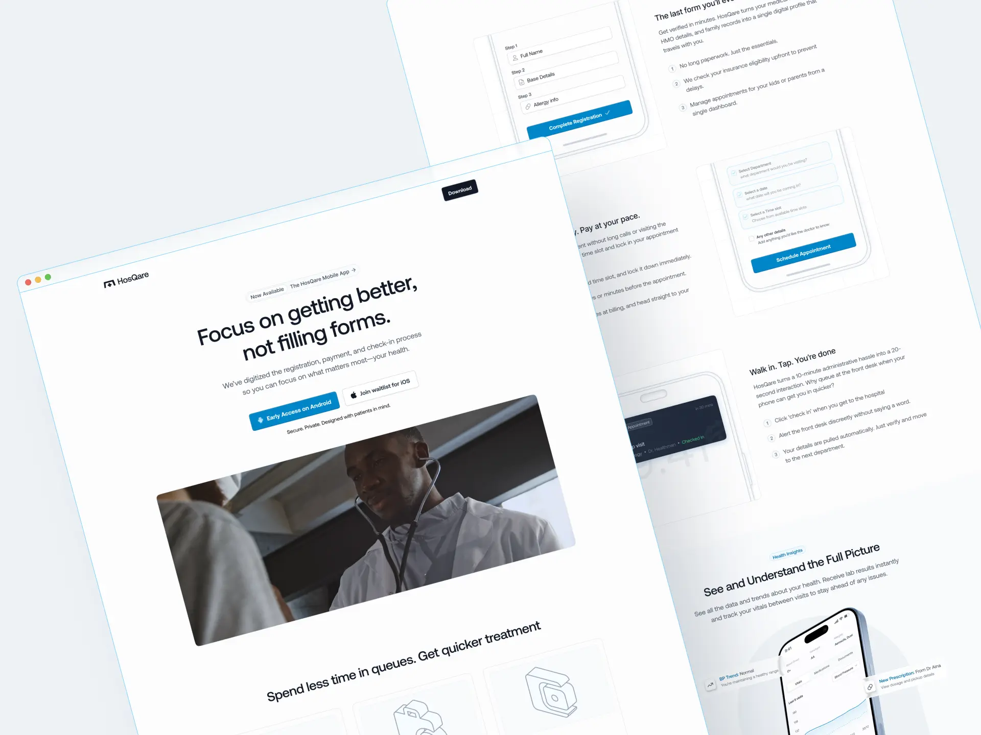
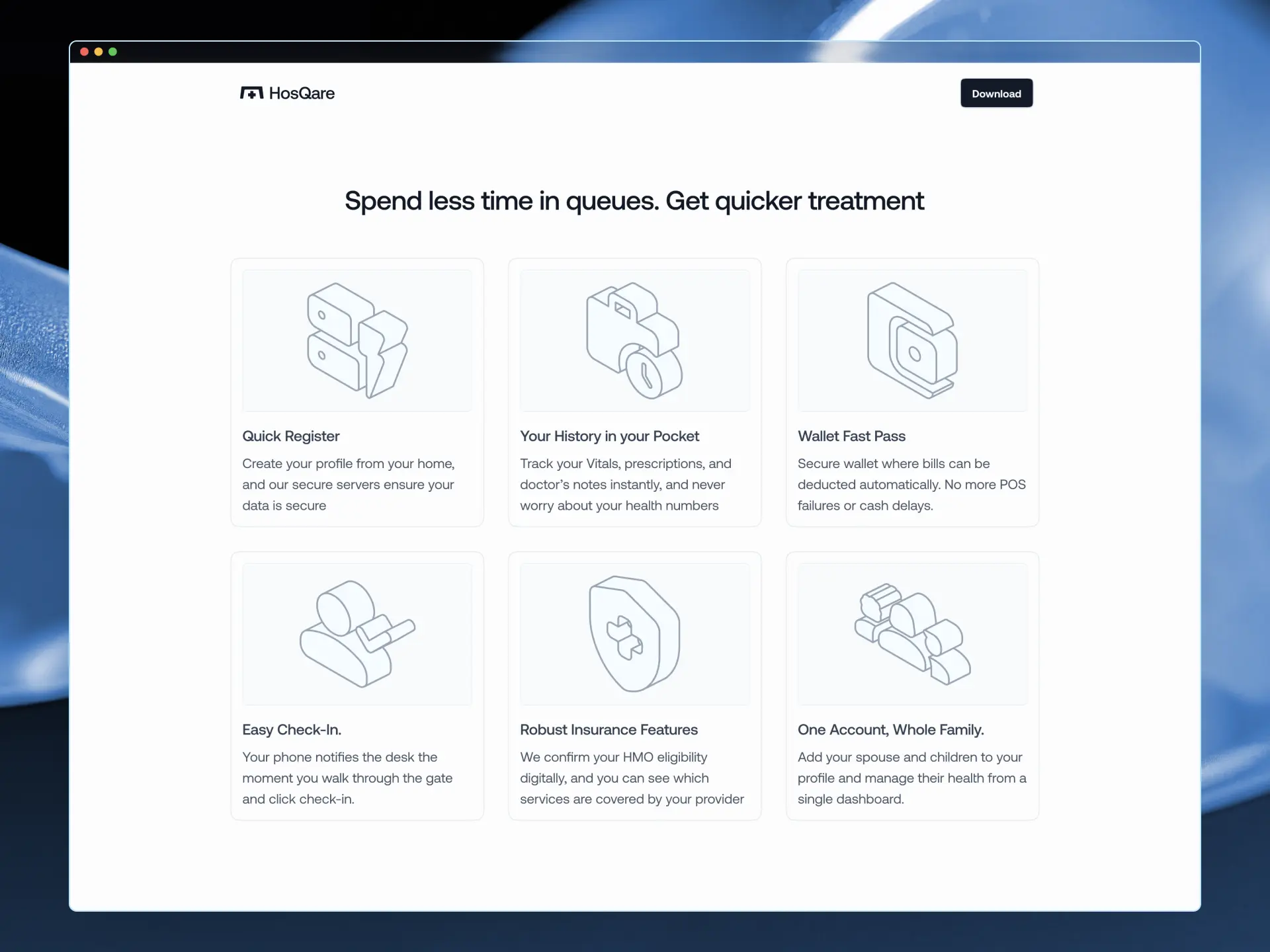
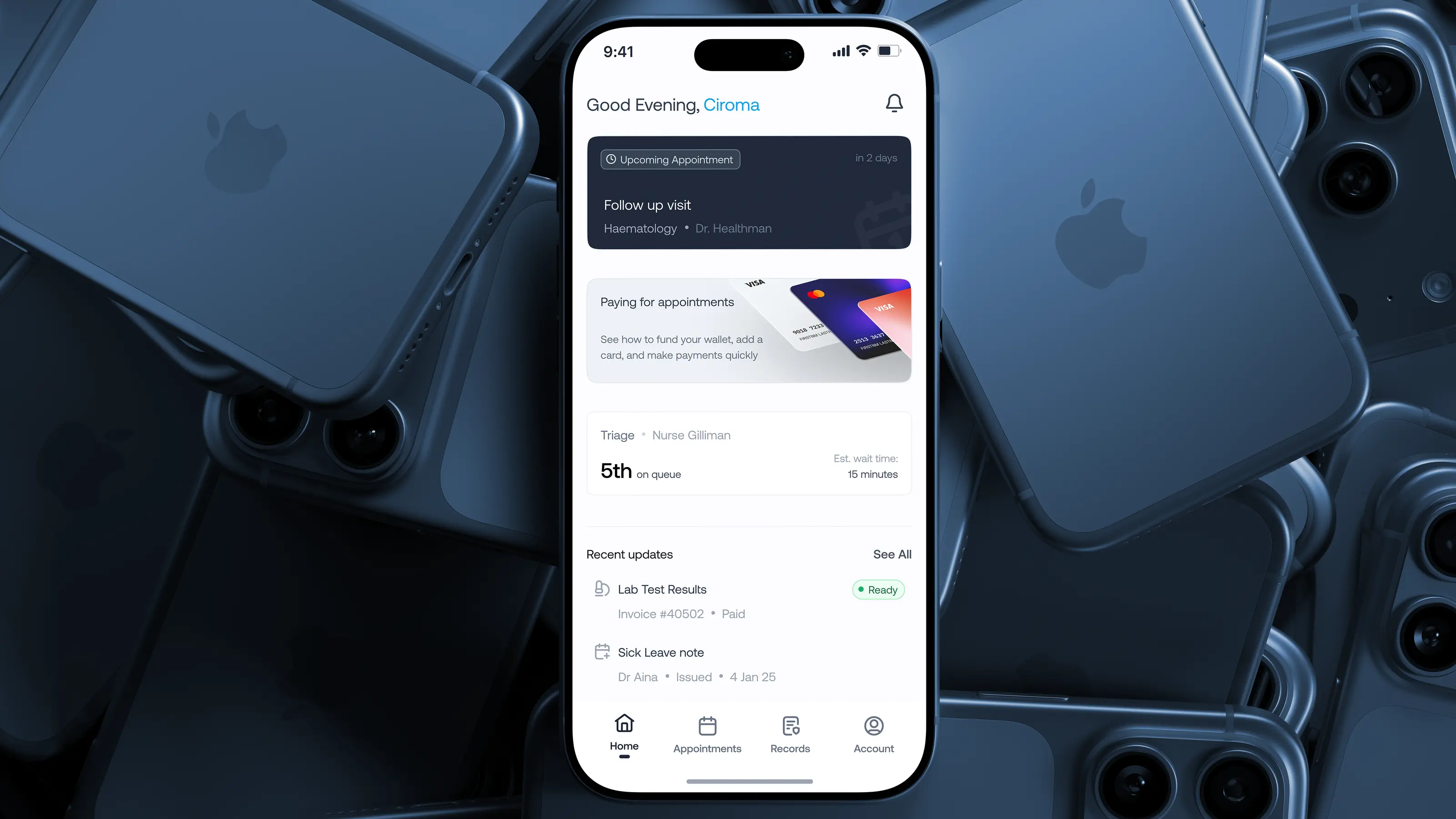
Product Designer and Bubble Developer
Jan 2024 to Sep 2025
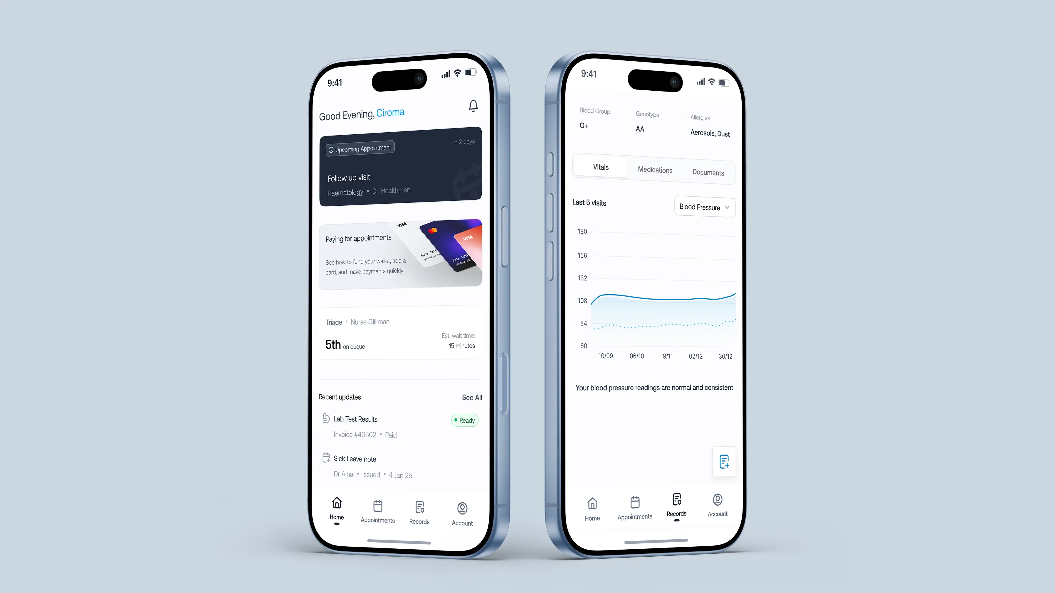
Executed the end-to-end UI implementation and Bubble.io development for the FISH application. Collaborated with cross-functional teams to streamline complex workflows and API integrations, cutting development time by 40%. Optimized information architecture and established QA dashboards to ensure a seamless and stable user experience.
Washington Capital Partners
Remote
Product Designer and Bubble Developer
Feb 2023 to Oct 2023
Conducted user interviews for product teams, ensuring their product ideas were solving real problems for real people. Improved the interfaces and experiences of web applications through well thought out and insight informed design, building the apps with bubble and integrating with 3rd party applications to deliver seamless experiences.
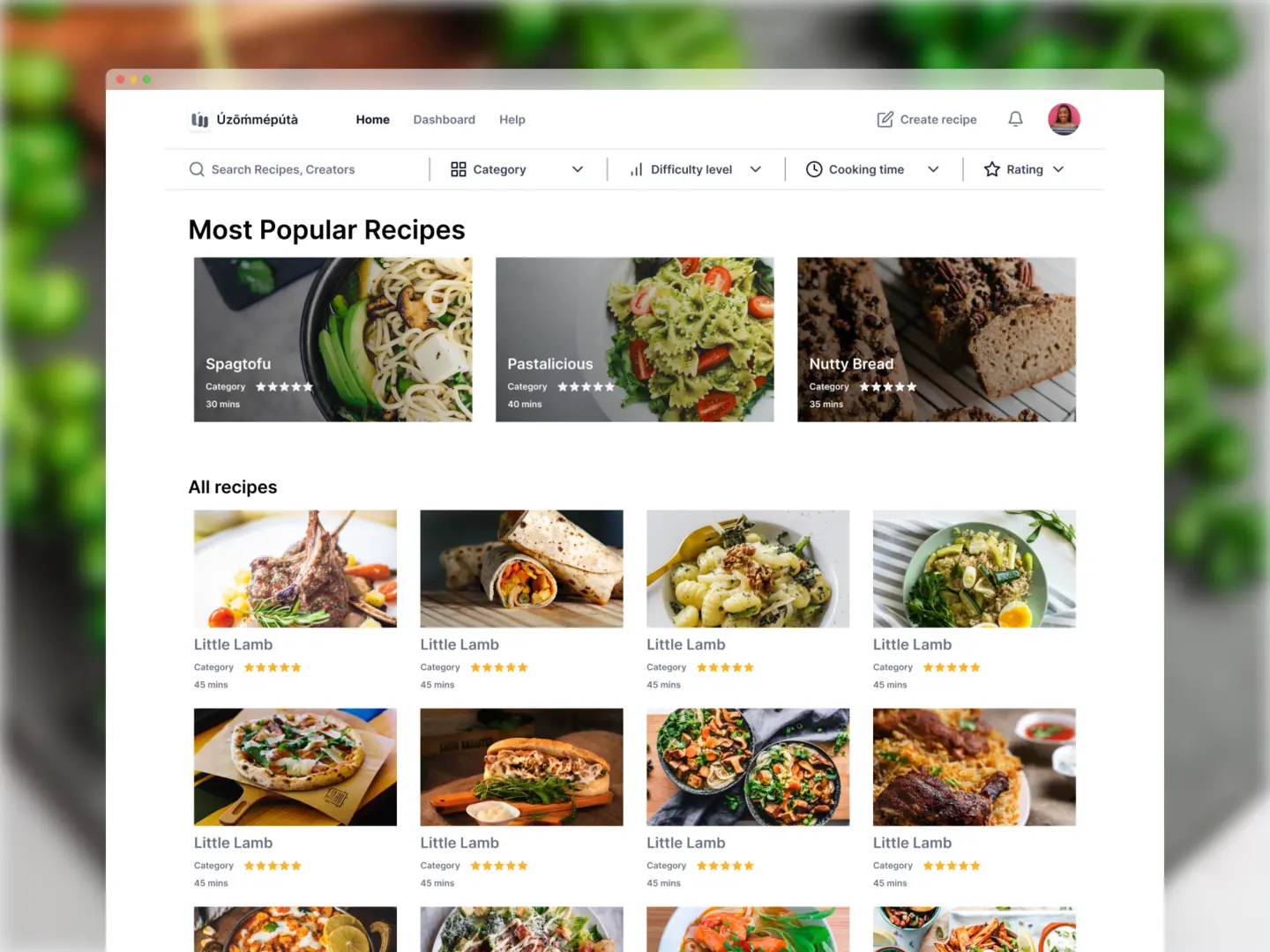
Skillhat
Remote
Product Designer
Aug 2023
Redesigned the entire website to ensure a modern, seamless experience that led to improved lead generation (a 40% increase in leads generated) for the consulting business.
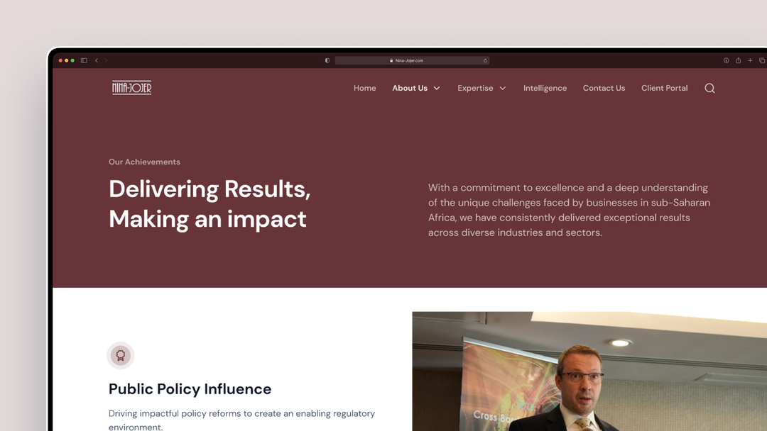
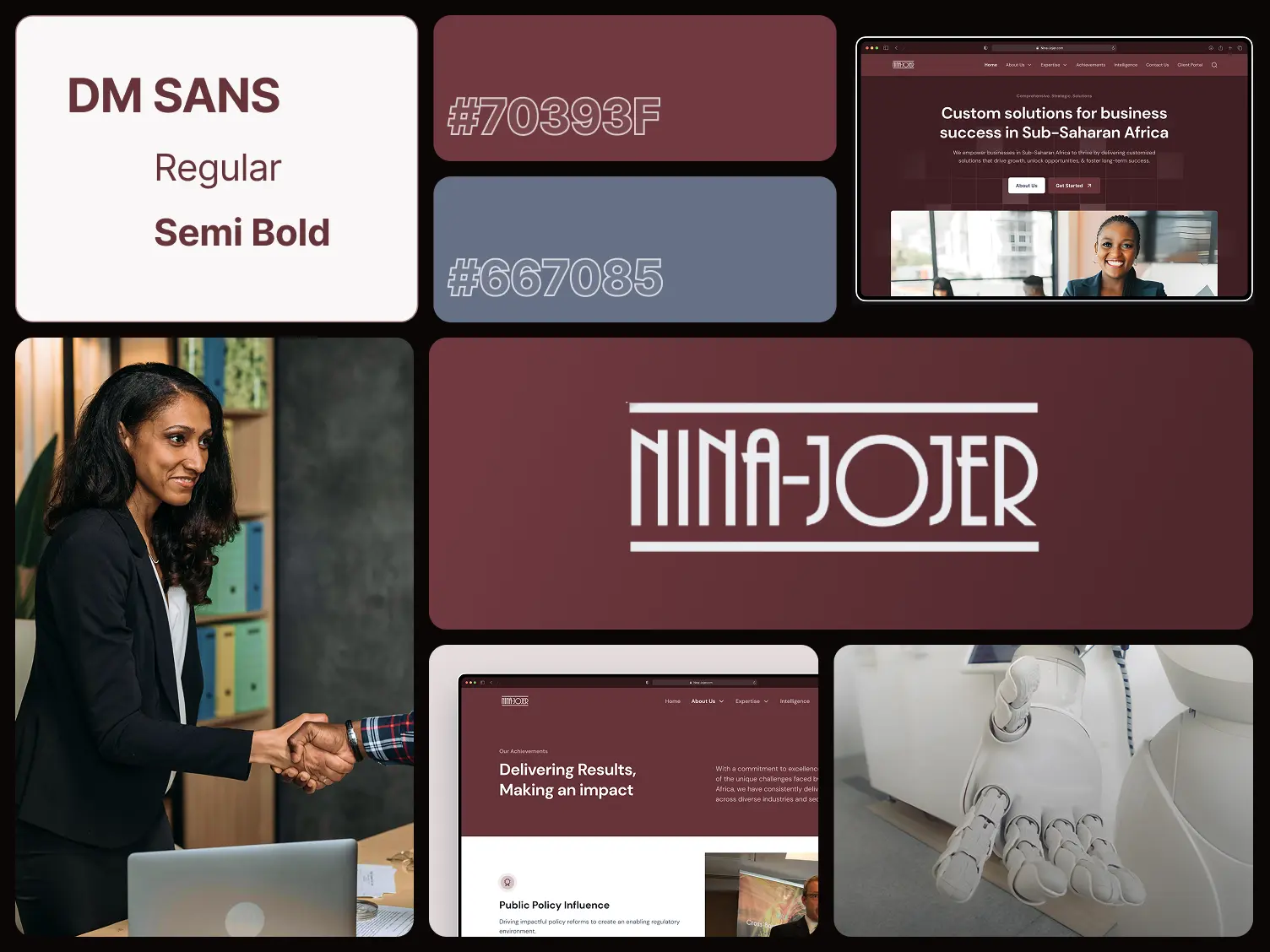
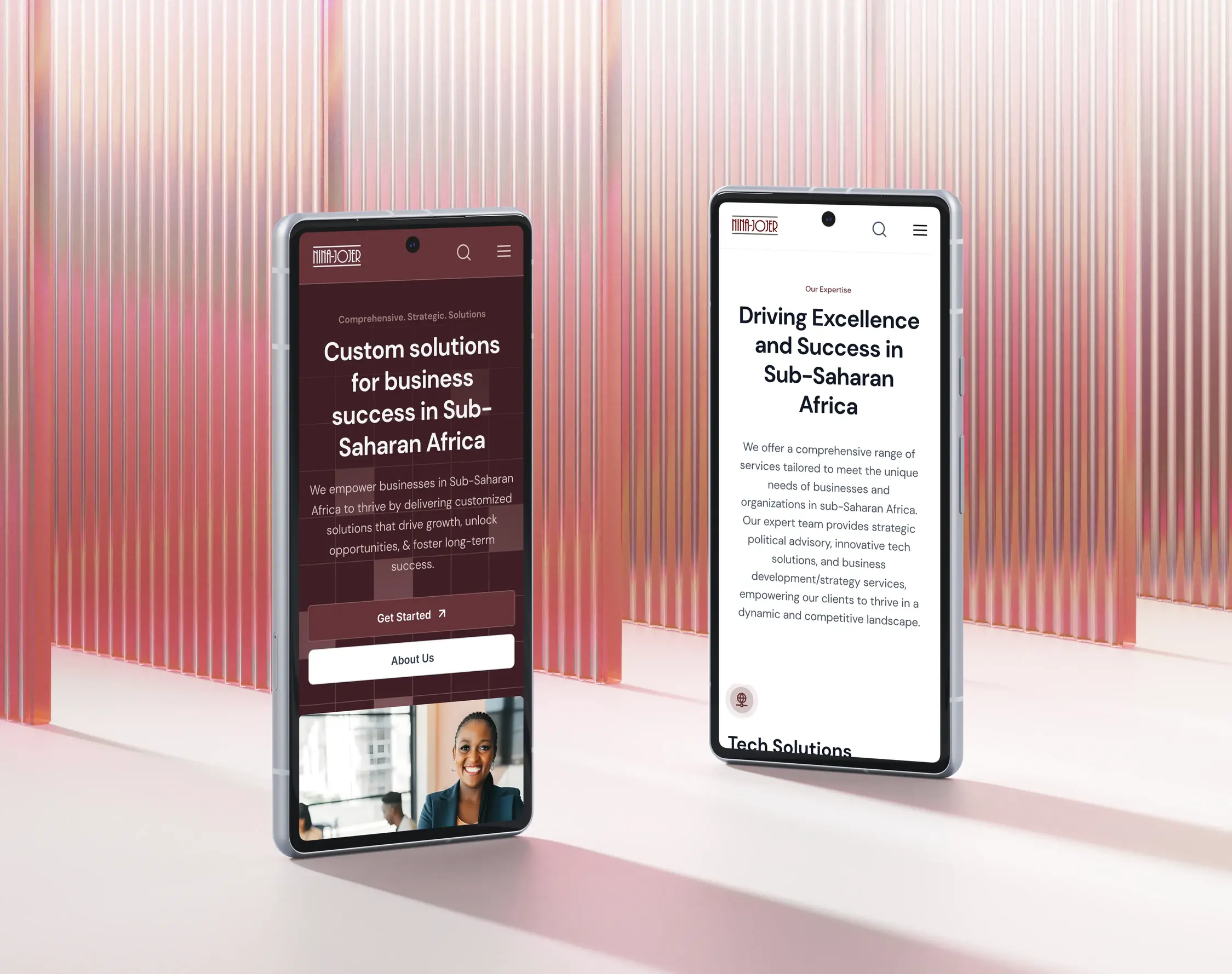
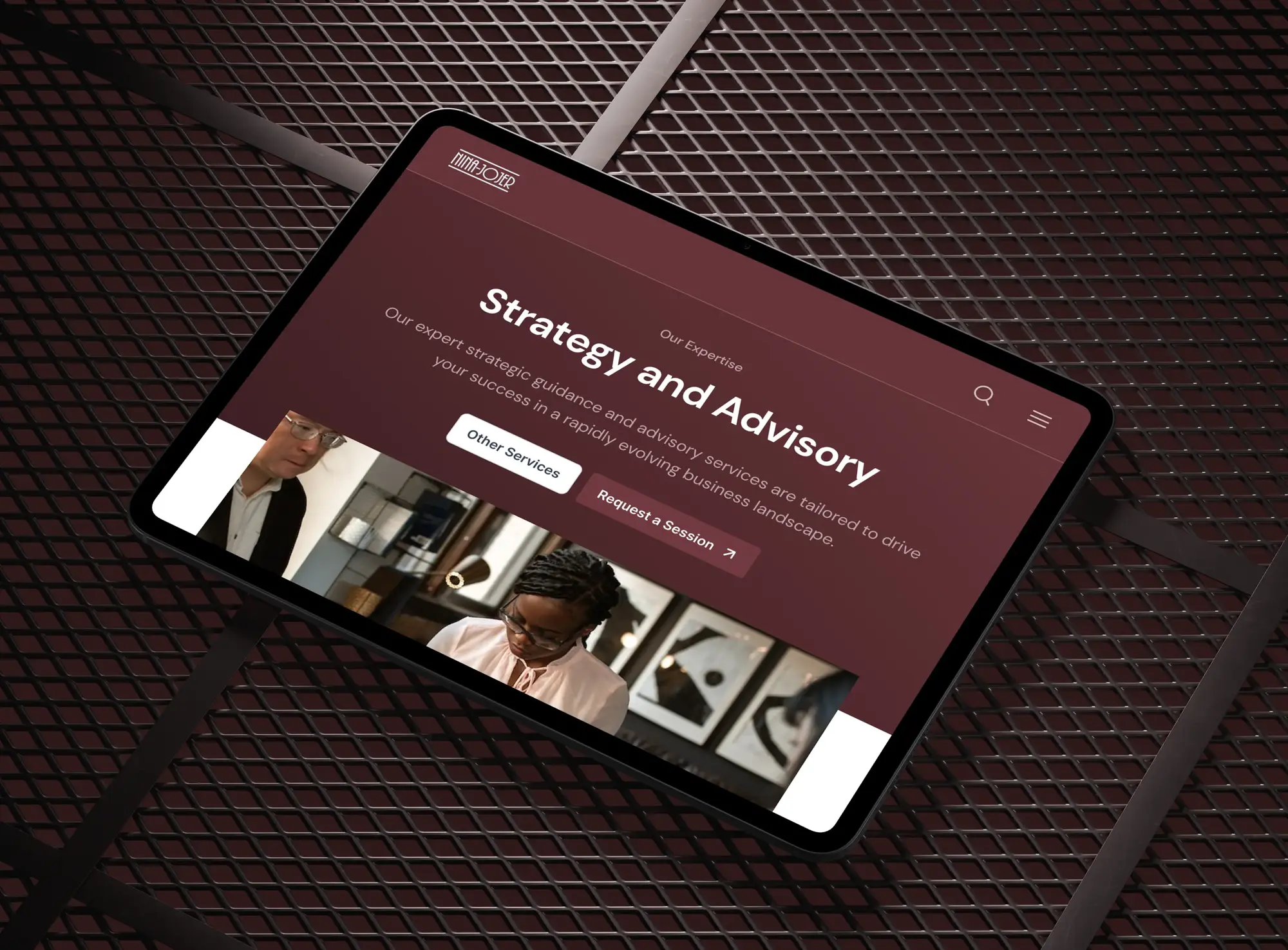
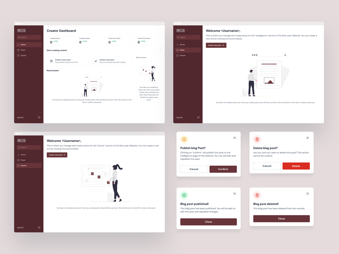
Niner-Jojer
Lagos, Nigeria
Product Designer
Sep 2022 to Jul 2023
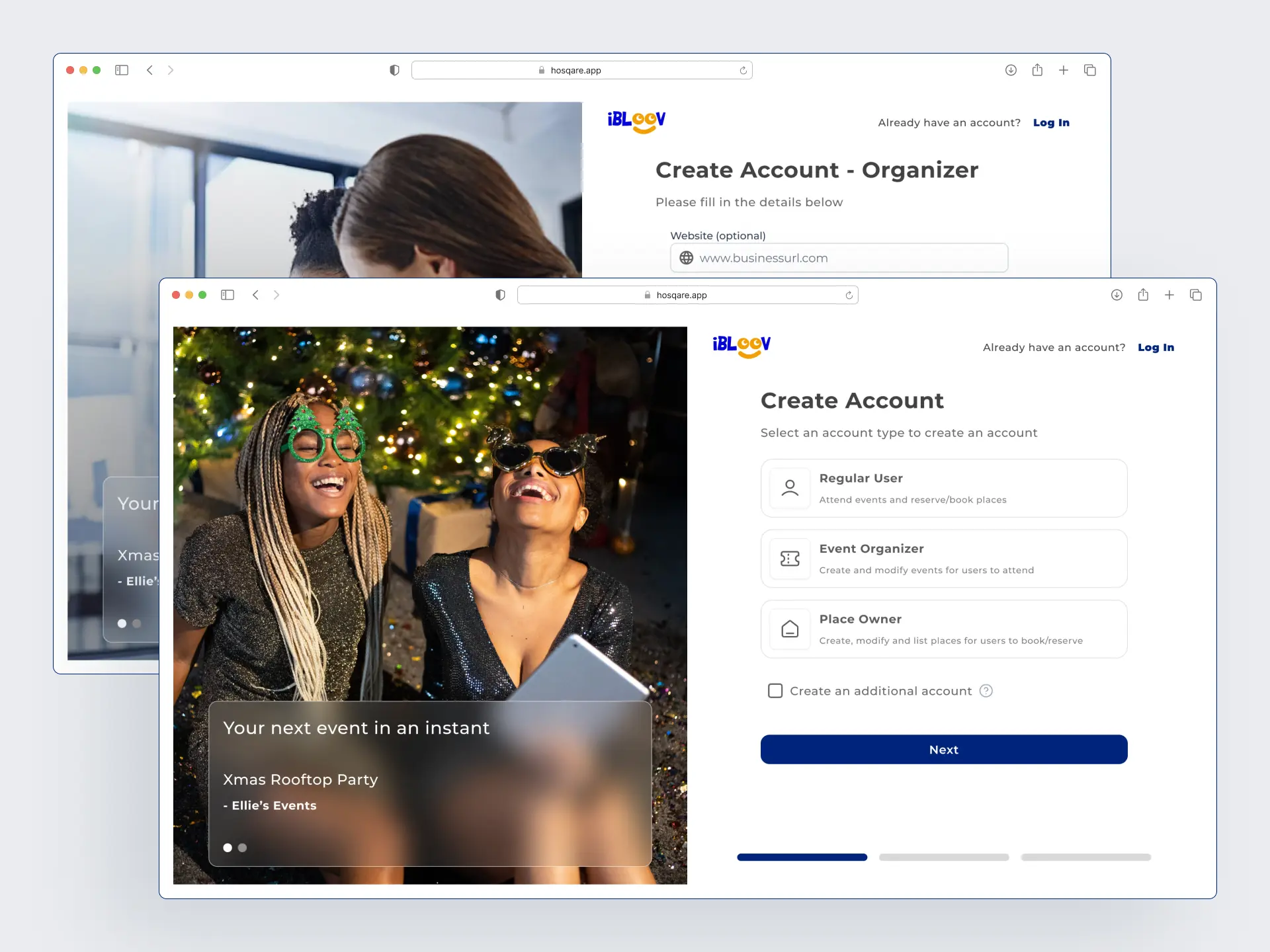
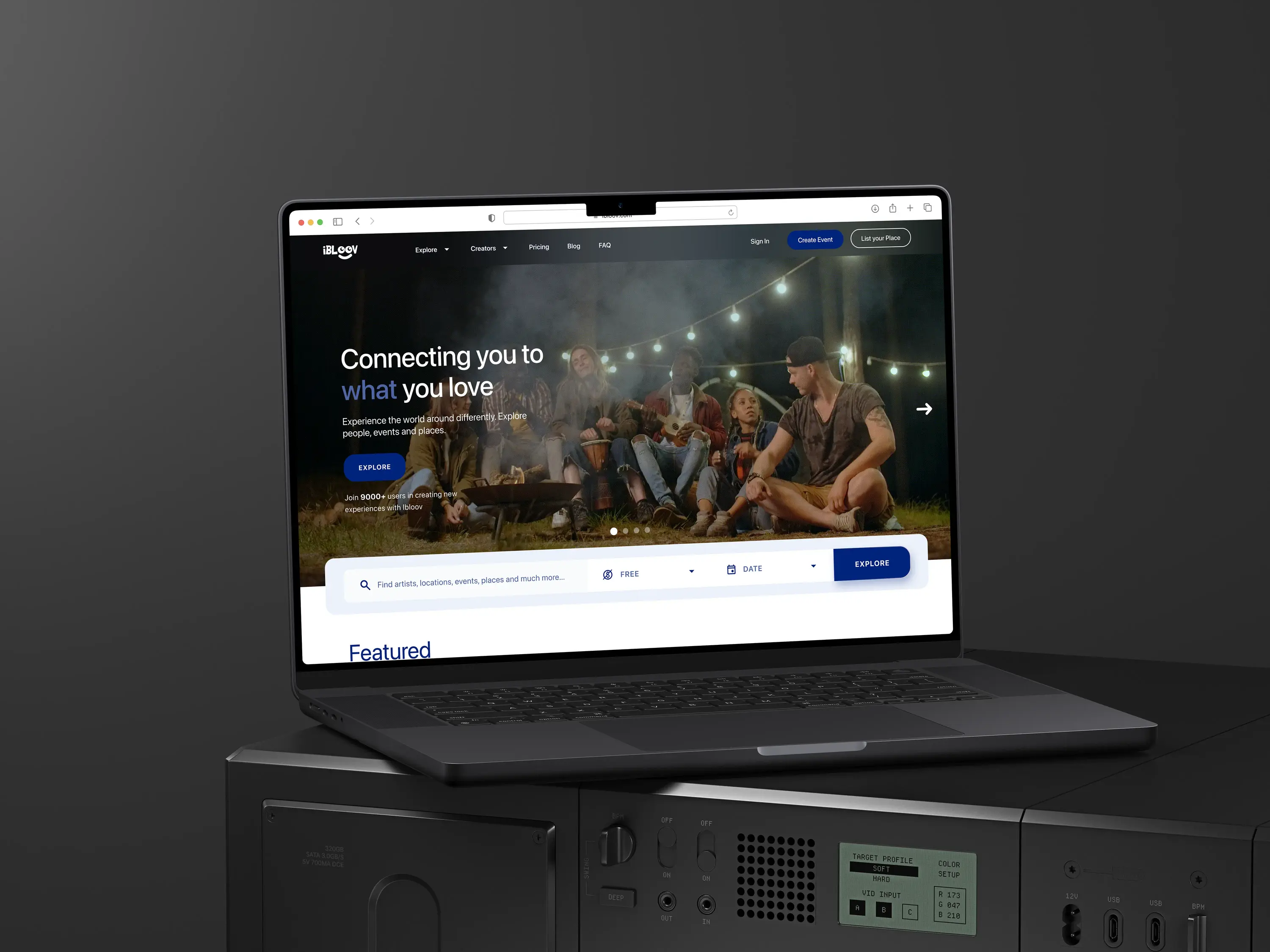
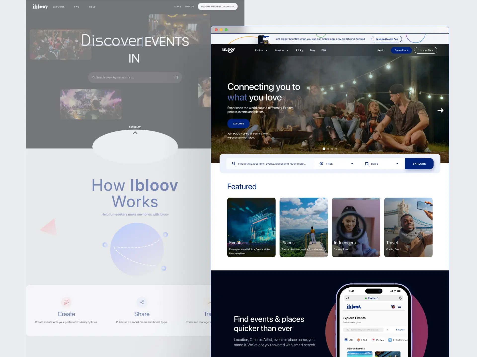
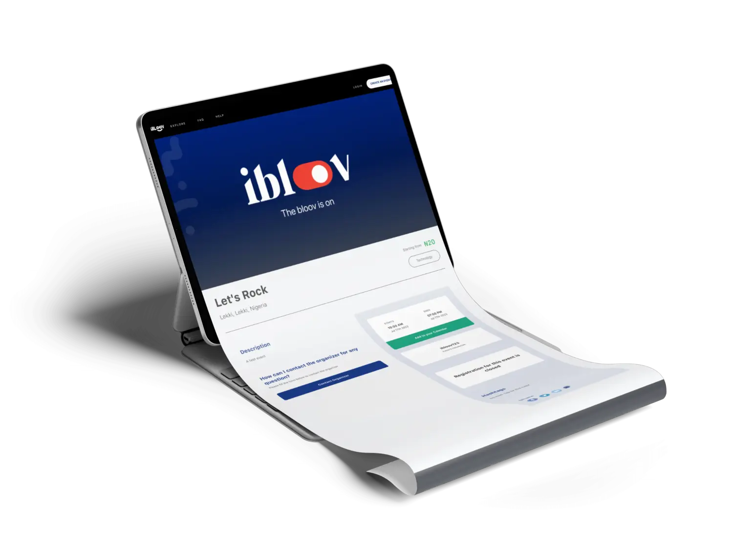
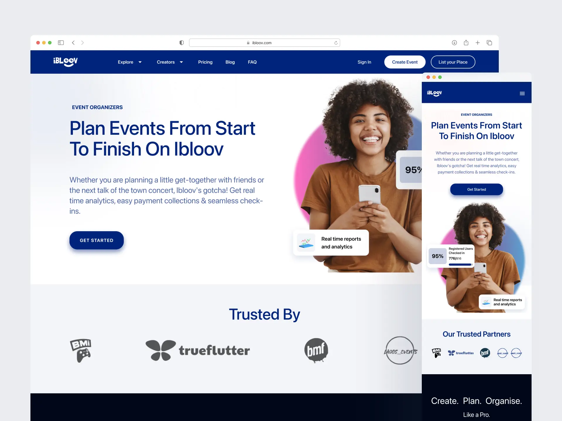
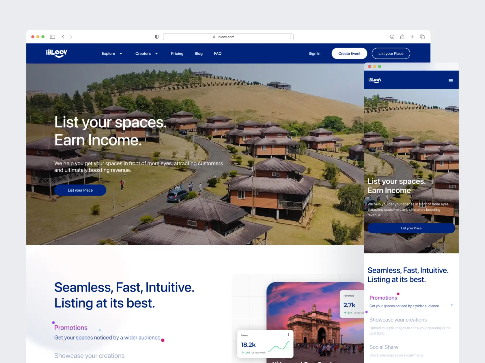
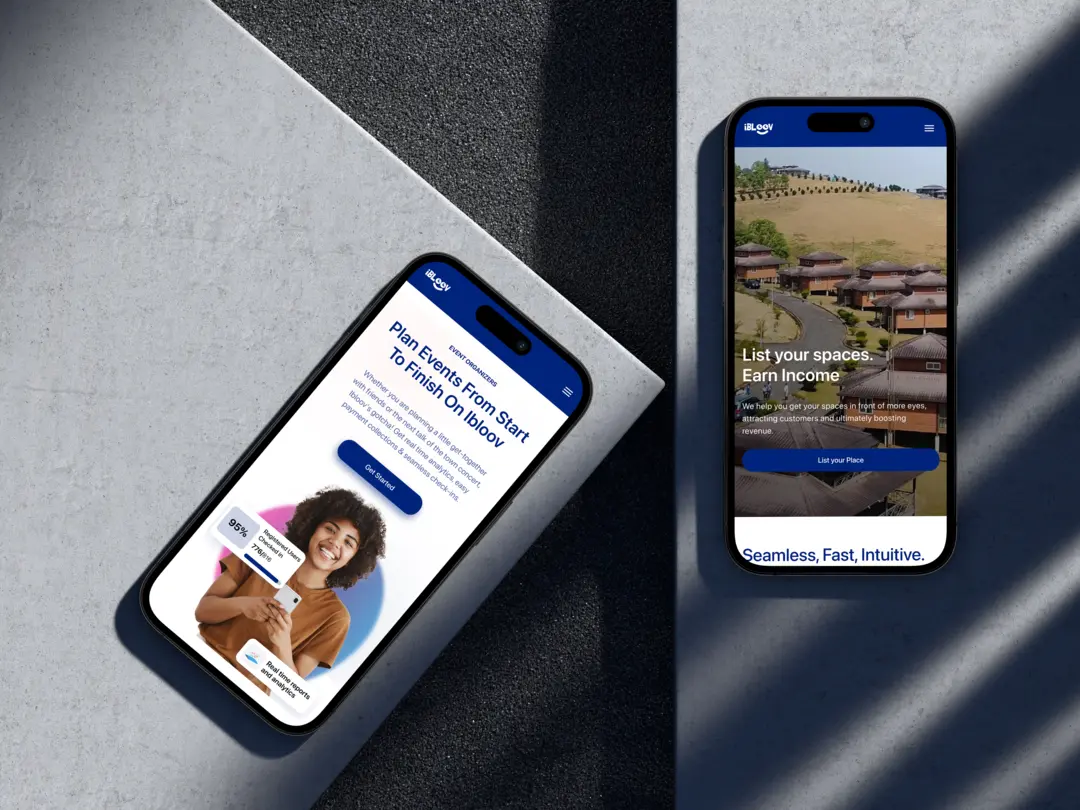
Conducted user research to optimize the user experience, redesigned the marketing pages and streamlined the event ticketing flow for Ibloov.com, resulting in a remarkable 200% increase in signups within 2 months. Also spearheaded creation of a comprehensive design system for all business verticals.
Hoshistech Corps (Ibloov)
Lagos, Nigeria
Product Designer
Aug 2022 to Sep 2023
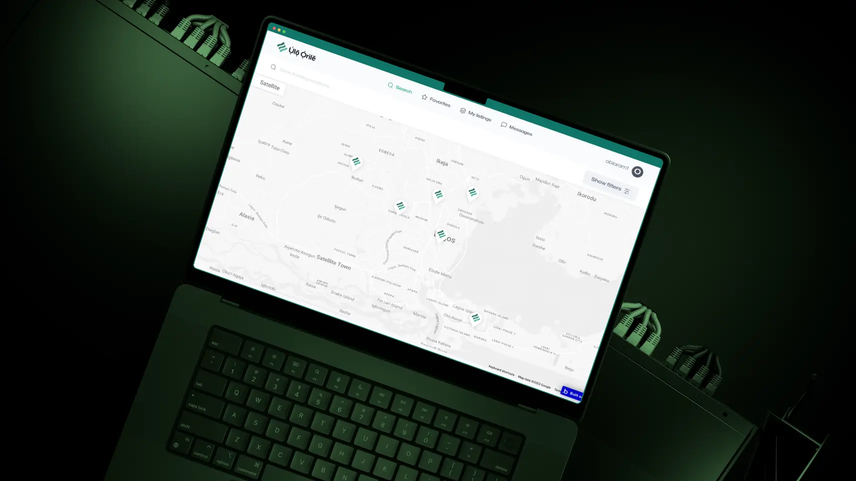
Revamped and redesigned the dashboard for the company's flaghip product, FieldMaxPro, resulting in a 40% decrease in user complaints, as well as improved app adoption and engagement.
Papyrus Digital Solutions
Lagos, Nigeria


.webp)
.webp)
.webp)
.webp)
.webp)
.webp)