subtext-risk.netlify.app
A clearer way to assess merchant risk
I redesigned a merchant-screening site to explain what gets checked, what teams receive, and how the product could fit into onboarding.
TYPE
Concept redesign, not affiliated with the original company
ROLE
Audit, positioning, copy, design, and front-end build
TIMELINE
About three weeks
STACK
Next.js, Tailwind CSS, Framer Motion, GSAP
Show the product before asking buyers to trust it
I created Subtext as a concept redesign for a merchant-risk product, taking it from site audit and positioning through copy, Figma, and a working front-end build. The sample reports, customer examples, and timing claims in the concept are illustrative; they are not measured company results.
Why I picked this company
I was looking through financial product startups in Y Combinator when I came across the company this concept is based on. Reading through its website, I started thinking about how it could get its message across better, and in a more engaging way.
What I set out to test
I wanted to see how much simple, direct copy, animation and modern design could improve the positioning and messaging of a financial product. I wanted a buyer to understand what the product does for them, and how, without decoding jargon.
The problem
Merchant acquirers need to assess the online footprint of businesses. The site needed to explain, in plain language, what gets screened and what an analyst receives.
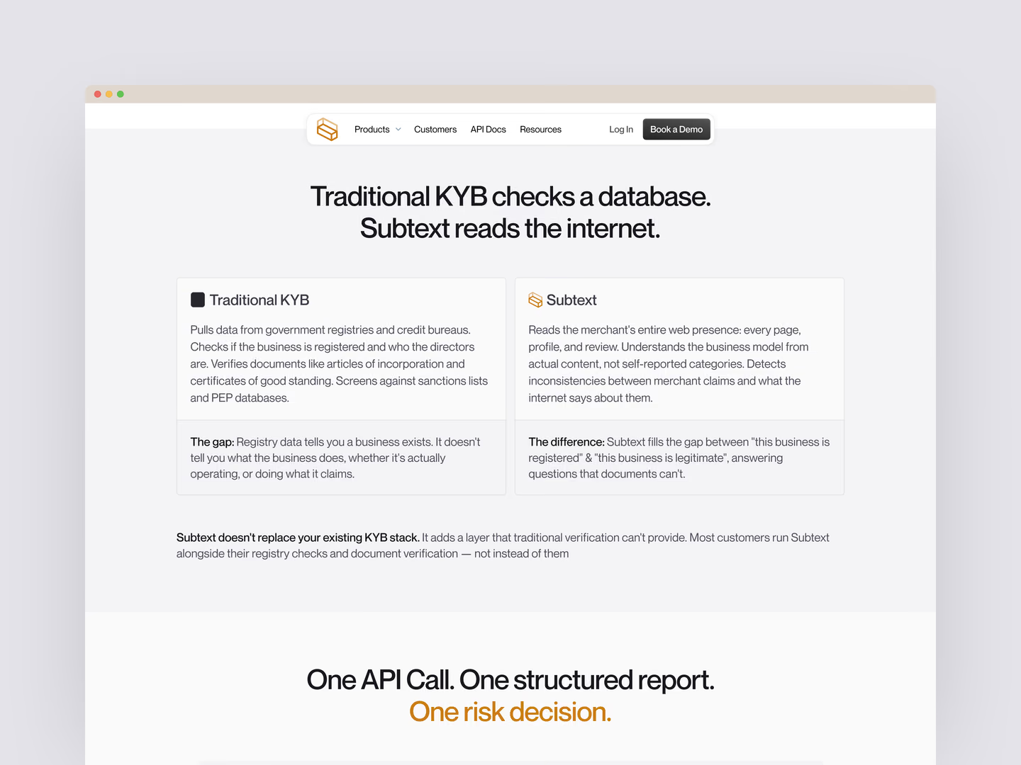
In my audit, those answers were hard to find among feature-led copy and sections that described capabilities before showing the product. I focused the redesign on three questions: What does Subtext check? What comes back? How could a team use it in its onboarding flow?
The redesign answers the first question with a side-by-side comparison of traditional KYB and Subtext.
Where my first approach fell short
I started with images and text: a cleaner layout and better copy. Then I listened to Katie Dill's talk on how Stripe redesigned its homepage and saw a reason to go deeper on the project. That led me to the animated sample report and the step-by-step sequence below.
What I changed
I showed prospective clients the output in multiple sections
The homepage and merchant screening page both feature a sample merchant report, so visitors can see what a screening tool returns. The example surfaces details such as a business’ website, industry, online presence, and risk level.
The report uses illustrative content, not data from a live Subtext product.
I made the screening flow easy to follow
A short animation moves from submitting a merchant URL, to checking sources, to revealing a report. It makes the proposed workflow visible without relying on a technical explanation.
The checks and timing shown are part of the concept. I did not validate them against a live system.
I wrote customer examples for distinct use cases
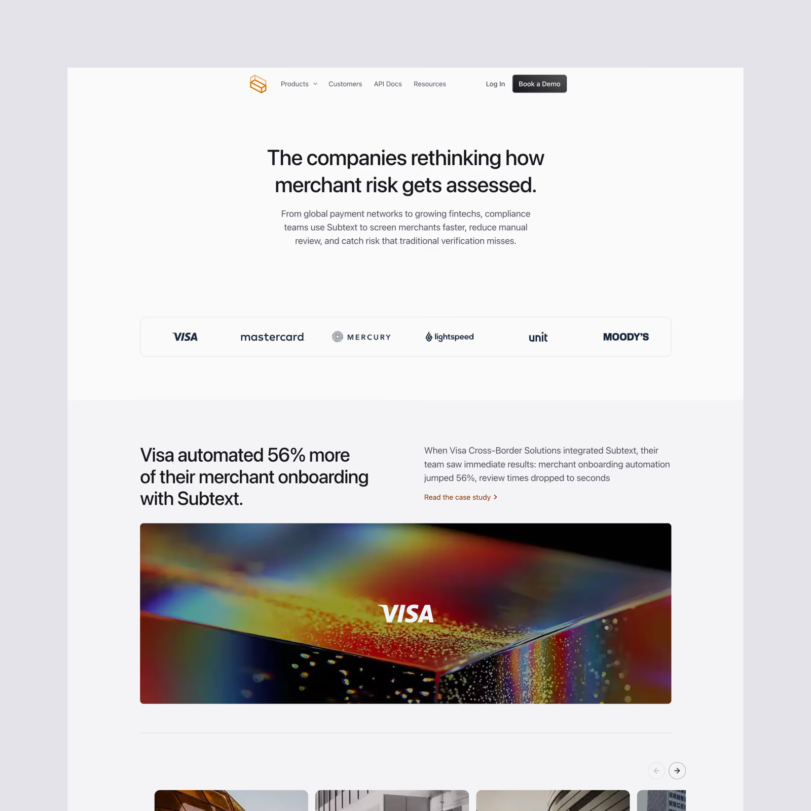
On the customer page, I framed the same product around different reasons a team might buy it. That gives prospective customers a chance to recognise a use case that applies to them.
One example line, “Screening 4,000 merchants without adding a single risk analyst,” is illustrative concept copy, not a verified customer result.
I carried the story through product and technical pages
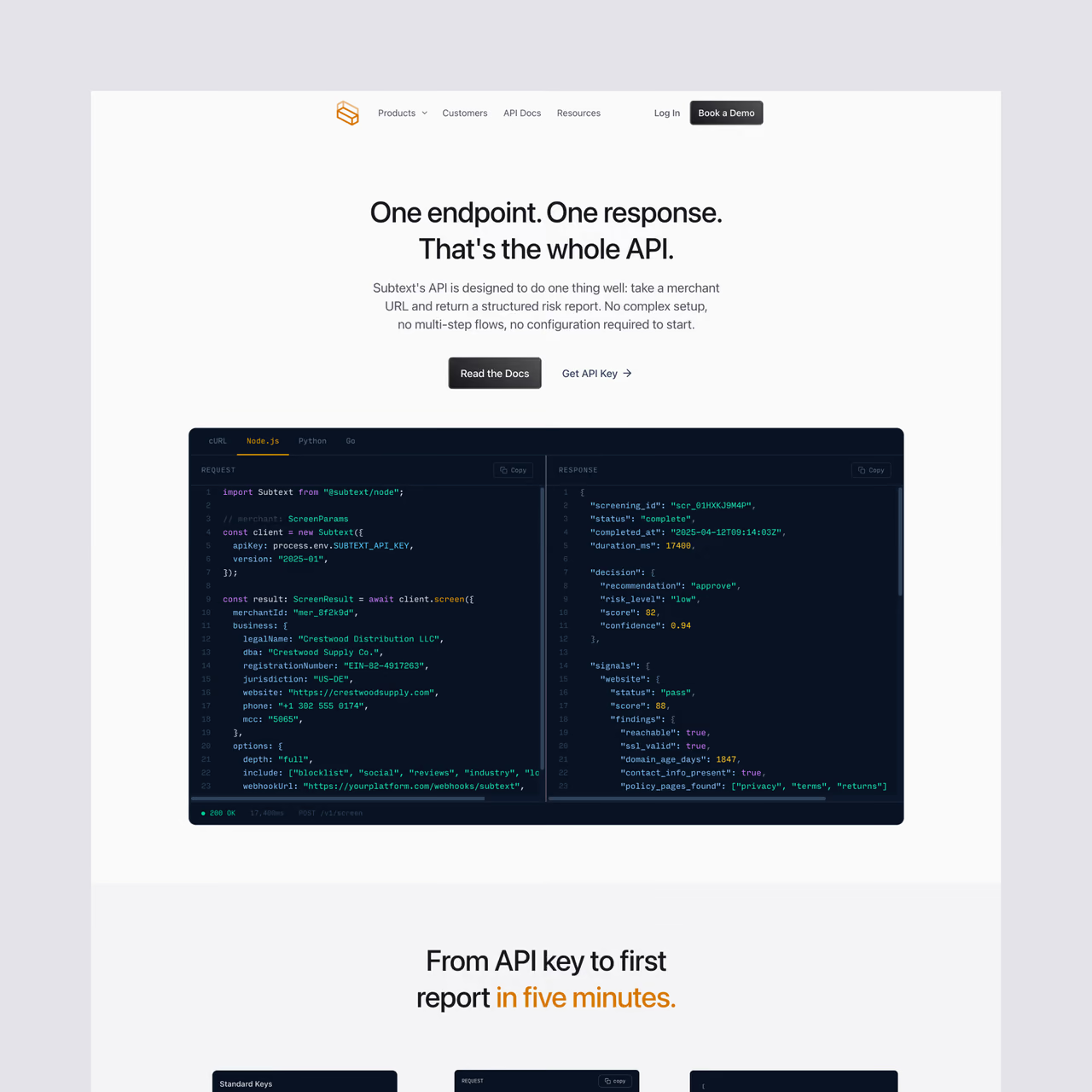
The product pages keep the same plain-language narrative while speaking to different needs. I also designed a blog page and developer documentation, carrying the visual system into content for people evaluating or integrating the product.
The docs page uses product-specific components and illustrations so a technical page still feels considered and easy to scan.
I made the visual details support the message
I paired a light interface and restrained amber accent with a mono typeface for report data. Custom illustrations, interface components, and subtle motion give the concept its own character and draw attention to useful actions.
I used custom illustrations to guide visitors through the navigation
The navigation uses custom illustrations to lead visitors to the site's most common areas of interest, which makes it easier for prospective clients to find out more about Subtext.
It takes inspiration from world-class design, adapted for this site.
How I built it
I worked solo across the audit, positioning, copy, design, and front-end build, completing the concept in about three weeks. I defined the colour, type, and spacing tokens first, then built the page components and motion in Next.js.
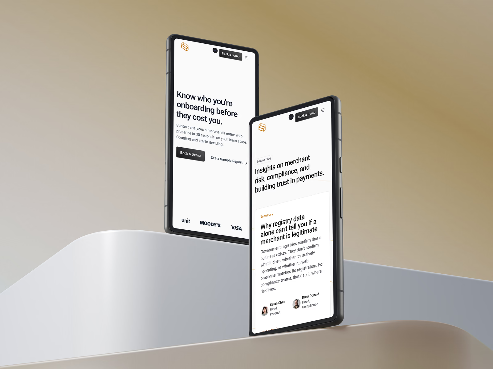
I also adapted the layouts for smaller screens, keeping the product explanation and dashboard visible while simplifying decorative elements.
What I learned
I learned how to build animation, and how to write direct, simple copy so the ideal user can tell what the product will do for them and how. The aim is to raise product usage, client acquisition and sign-ups. This is a concept, so I haven't measured any of that.
What I’d test with real users
I would first ask merchant-acquiring teams to explain, in their own words, what Subtext checks and what they receive. Then I would test which next step is more useful: viewing a sample report or booking a demo.
I would also verify any screening-time claim against real product data before presenting it as a fact.